Hi! I’m currently an undergraduate studying Computer Science at the University of California, San Diego.
Aside from coding, I also do a fair bit of writing and graphic design, which several of the projects on this site showcase. You can find all my code on GitHub.

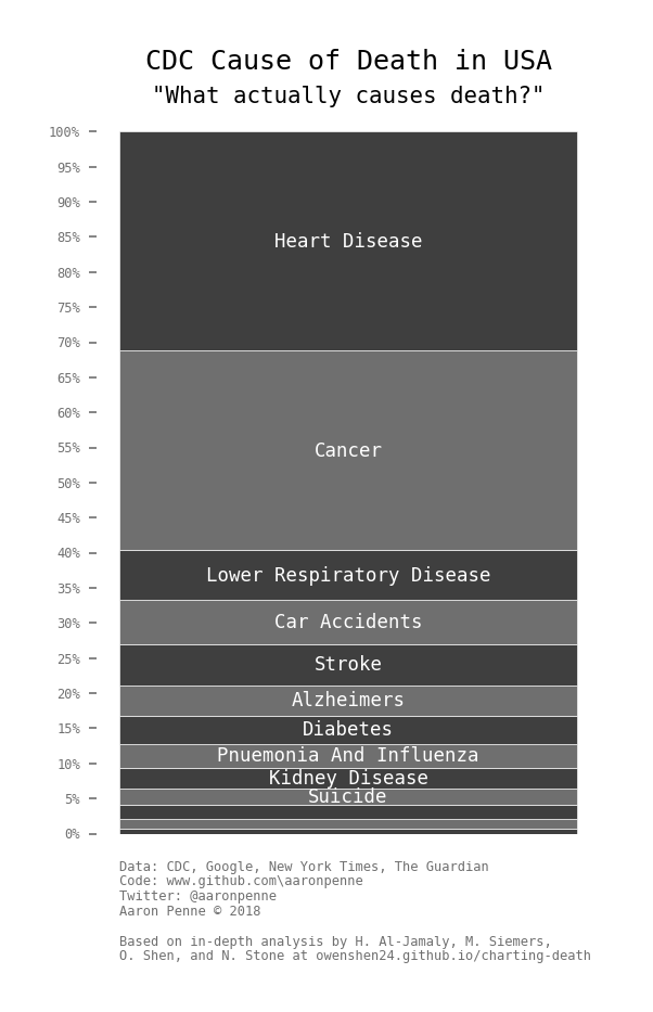
Charting Death
Charting Death is a data science project that examines the ways we die and compares that to newspaper mentions of the aforementioned causes of death. As one might expect, it turns out the certain causes of death (heart disease, kidney disease) are underrepresented in the news and others (homicide, terrorism) are overrepresented.
The visualization below, based off this data, is currently the most upvoted post of all time on Reddit’s r/dataisbeautiful, at 100,000+ upvotes and has been viewed over 2 million times.